I know, I know, not another IKEA crazed woman, yes it’s true, so here’s my big confession for my obsession and passion over Ikea:
I can’t contain myself from being inspired by Ikea. Their furniture is simple, clean, fun, adaptable, and sooooo uber affordable, it makes my head spin. In fact, I seriously have to restrain myself from going to the design-on-a-budget mecca when I drive by, it’s like a drug and my right side of my brain is looking for an Ikea creative fix! How does one amazing huge blue box have that kind of effect? I remember the days not so many years ago when my friend and I would drive to San Diego for an Ikea weekend and now, but alas, I have my very own store in the state of Arizona, talk about true happinesssssss!
In a world of lovers and not so lovers, I am hoping to inspire, redirect and even perhaps convince the masses that the world would be a very sad design place without Ikea.
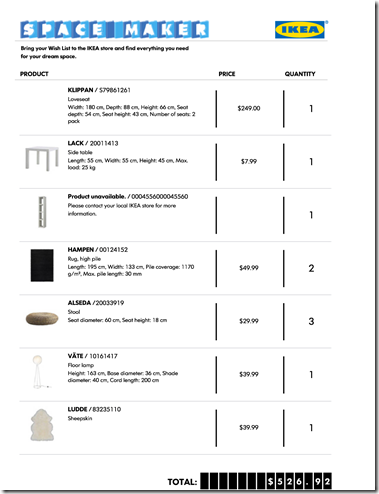
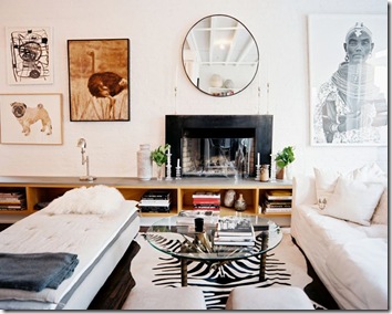
So I’m thumbing through my 2011 Ikea catalog for the two hundred and thirty-second time and can’t hardly believe I missed the page in the teen section showcasing “spacemaker” http://www.ikea.com/ms/en_US/rooms_ideas/planner_youth/index.html – the dream room planner . No way, now I can design thousands of rooms with ALL the Ikea products at my finger tips, ummm, no, not so much! But, if you’re in the mood to test out a few Ikea looks, this is a handy tool. Below is my first test run, I added the Lack coffee table and plain pillows since these were not offered in the various menus. Be sure to click on the “watch it work” before you begin the fun.

This is also my attempt to design my own White Box from HGTV’s Design Star designer’s challenge. I must confess, I tried out for the show and was not selected, oh well, if you can’t beat, join em, right?
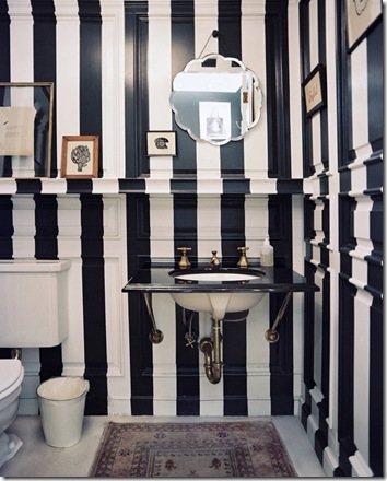
So below is a very safe list of ideas to incorporate into the scheme above with three different looks while being true to Ikea for the main parts and pieces and our black and white vision this month:
- hippie oh so now (hippie vib with a clean white backdrop): Remember layers, no matchy-matchy. To get the look add various paintings that cover the entire back wall with minimal spacing, keep the look very random; add an Ikea PS Stuga Rug and your favorite incense, groovy!
- cottage modern (all things cottagey from Ikea): Staying true to clean, paint the back wall a dark charcoal; add some books wrapped in brown paper bag covers (youtube this how-to); add some oversize farm implements, or a mix of faux trophy heads; using the Ikea Ribba Frame print black and/or white large letters from a print shop to the size of the frame to spell out a saying such as “enjoy (1st row), life& (2nd row) and smile (3rd row)” to place on the back wall.
- industrial chic (heavy-metaly): Add some precut squares or rectangles, the same size of course, particle board or plywood panels to cover the ENTIRE back wall and bolt in place only if you don’t rent or you have a landlord who gives permission for you to do this; hang 3 of the Grundtal Mirrors with about 3-6” inches of space between them horizontally on the side wall, cool dude!
See shopping lists below:

- IKEA Lack Coffee Table - $19.99 http://www.ikea.com/us/en/catalog/products/00095036
- IKEA SorglosVases – $14.99 & $12.99 http://www.ikea.com/us/en/catalog/products/10164190
- IKEA Sockerart Vase - $19.99 http://www.ikea.com/us/en/catalog/products/30148463
- IKEA Pjas Woven Bowl/Vase- $12.99 & $39.99 http://www.ikea.com/us/en/catalog/products/30107132
- IKEA Aryd Pillar Candle Holders- $9.99 & $12.99 http://www.ikea.com/us/en/catalog/products/70188174
- IKEA Grundtal Round Mirror - $29.99 http://www.ikea.com/us/en/catalog/products/40047883
- IKEA Ribba Frame - $19.99 http://www.ikea.com/us/en/catalog/products/20078050
- IKEA Henny Rand Cushion Cover - $9.00 http://www.ikea.com/us/en/catalog/products/20173919
- IKEA Stockholm Cushion - $12.99 http://www.ikea.com/us/en/catalog/products/60103236
- IKEA Kajsa Trad Cushion Cover - $7.00 http://www.ikea.com/us/en/catalog/products/40151681
- IKEA Vilmie Throw - $19.99 http://www.ikea.com/us/en/catalog/products/20174952
- IKEA Vilmie Figur Cushion Cover - $10.00 http://www.ikea.com/us/en/catalog/products/90174939
- IKEA Ektorp Limbar Cushion in Idemo Black - $19.99 http://www.ikea.com/us/en/catalog/products/00143914
- IKEA Vilmie Rund Throw - $19.99 http://www.ikea.com/us/en/catalog/products/60174950
- IKEA Ofelia Throw - $29.99 http://www.ikea.com/us/en/catalog/products/30139623
- IKEA Fargrik Hogst Plate - $4.99 http://www.ikea.com/us/en/catalog/products/00164478

“i-see-a” is the everything Ikea fill-in post. Stay tuned for more, I promise you, it will be worth the adventure, the ideas are as far and wide as those lovely concrete polished floors of their warehouse lined with boxes of simplicity waiting to be unveiled. Also, stay tuned for the funkiest of funky White Box creations!


